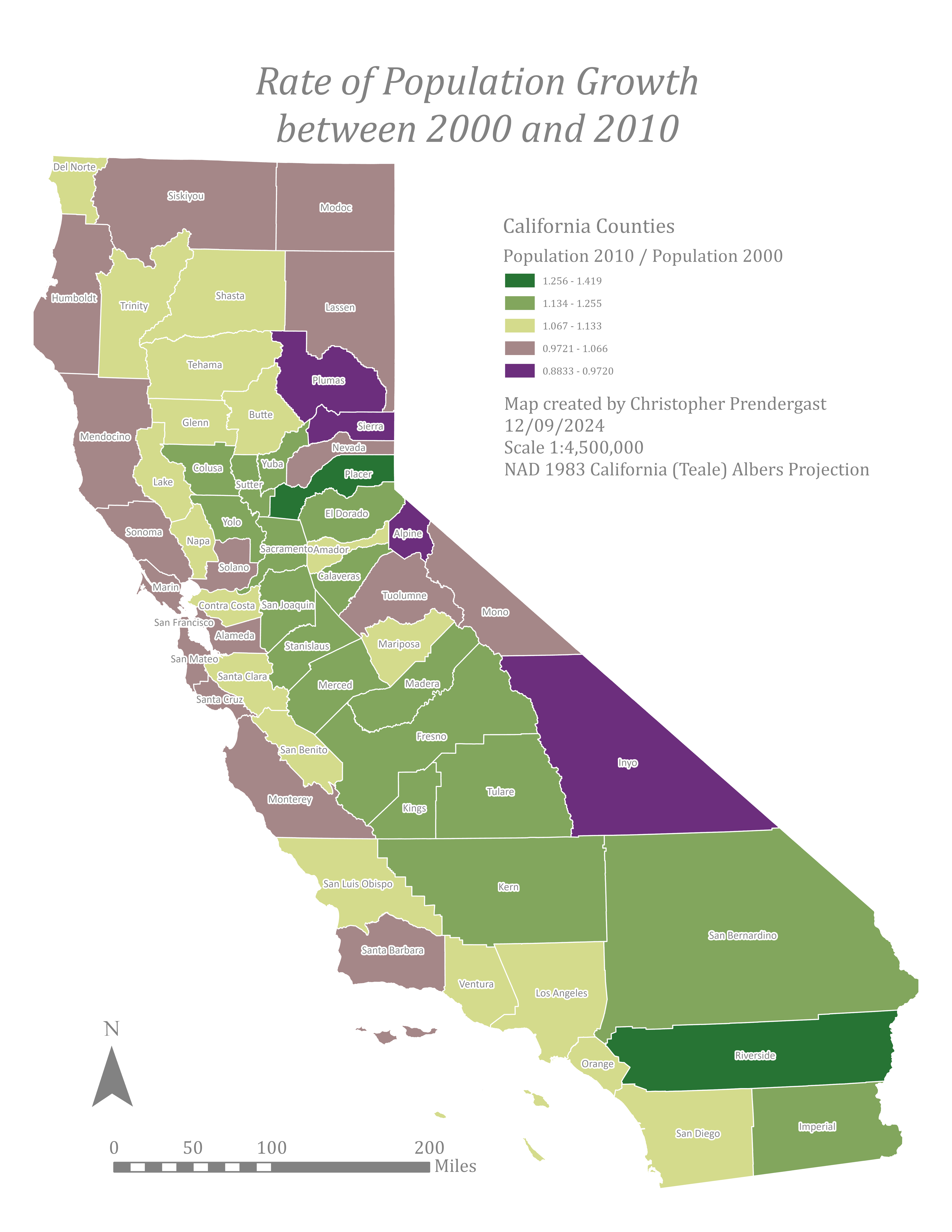
The California Population Map (2000–2010) illustrates the rate of population growth or decline for California counties between 2000 and 2010. Areas shaded in green indicate population growth, while areas in purple indicate population decline. Darker shades correspond to larger changes, whereas lighter shades represent smaller changes.
The map is projected using the California (Teale) Albers projection, a state-specific adaptation of the Albers Conical Equal Area projection developed by the former California Teale Data Center GIS Solutions Group. This projection is optimized for accurate area calculations within California.