Overview
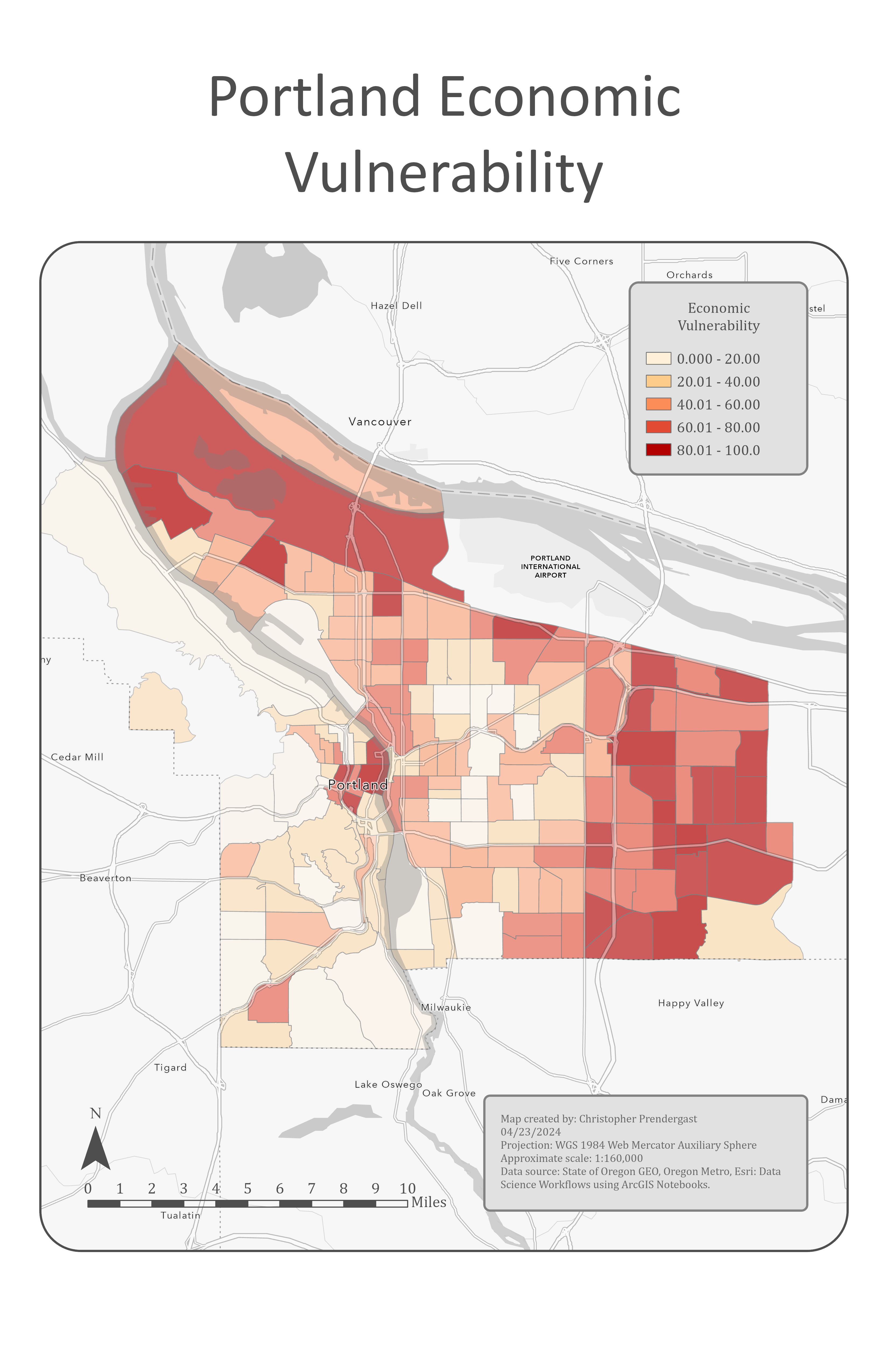
The Economic Vulnerability Map visualizes areas in Portland, Oregon, where residents are at greater risk of economic hardship and potential displacement. It uses choropleth symbology to show variation in vulnerability across neighborhoods.
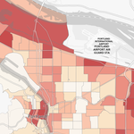
Portland Economic Vulnerability Map
- Areas shaded dark red represent the highest levels of economic vulnerability.
- The northwestern and eastern portions of Portland exhibit the greatest risk.
Interpretation
The map highlights neighborhoods most vulnerable to economic stress and displacement. It provides a decision-support tool for community planners to prioritize housing stability, social services, and targeted economic development programs.
Data Source
- Vulnerability Feature Class from the WorkingWithData geodatabase.
- Attributes include a
vulnerabilindex field representing levels of economic risk.
Methods
- Data Preparation
- Imported the Vulnerability feature class into ArcGIS Pro.
-
Accessed field and dataset properties through ArcGIS Notebooks.
-
Visualization
- Applied graduated colors symbology using the
vulnerabilfield. - Defined five classification breaks.
- Used a discrete color scheme. Darker rad areas have the highest economic vulnerability, while lighter colored areas are less vulnerable.
Tools Used for Economic Vulnerability Map
| Tool/Component | Purpose |
|---|---|
| ArcGIS Pro | Main GIS platform for data visualization and analysis. |
| ArcGIS Notebook | Used to write and execute Python code for data exploration and mapping. |
| arcpy (Python library) | Accessed geodatabase, feature class properties, and applied symbology. |
| Graduated Colors Renderer | Created choropleth symbology based on the vulnerabil field. |
| Discreet Color Schemep | Visualized levels of vulnerability, with deep red indicating highest risk. |
| Classification (5 breaks) | Divided vulnerability values into five categories for mapping. |