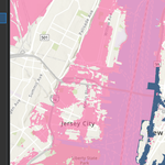
This set of maps illustrates how elevation data can be used to model hurricane storm surges and their impacts on New York City. The first map provides a base elevation layer derived from ArcGIS Living Atlas, showing the ground surface heights across the city and forming the foundation for flood analysis. Building on this, a 3-meter storm surge map highlights the low-lying coastal areas most at risk during a moderate hurricane, with flooded zones symbolized in light pink. This scenario is then compared against the Hurricane Sandy inundation map from 2012, which shows the actual flood extent recorded during the storm. The comparison reveals that Sandy’s surge slightly exceeded the 3-meter threshold, underscoring the accuracy and limitations of the modeled scenario. To explore more extreme conditions, a 9-meter storm surge map was also created, representing a severe event similar to the 1893 hurricane that nearly submerged Hog Island. Displayed in orange, this map demonstrates how much more of New York City would be inundated under a higher surge level. Together, these maps show the progression from potential flood modeling to historical validation, offering a clear visualization of both current and future coastal vulnerabilities.
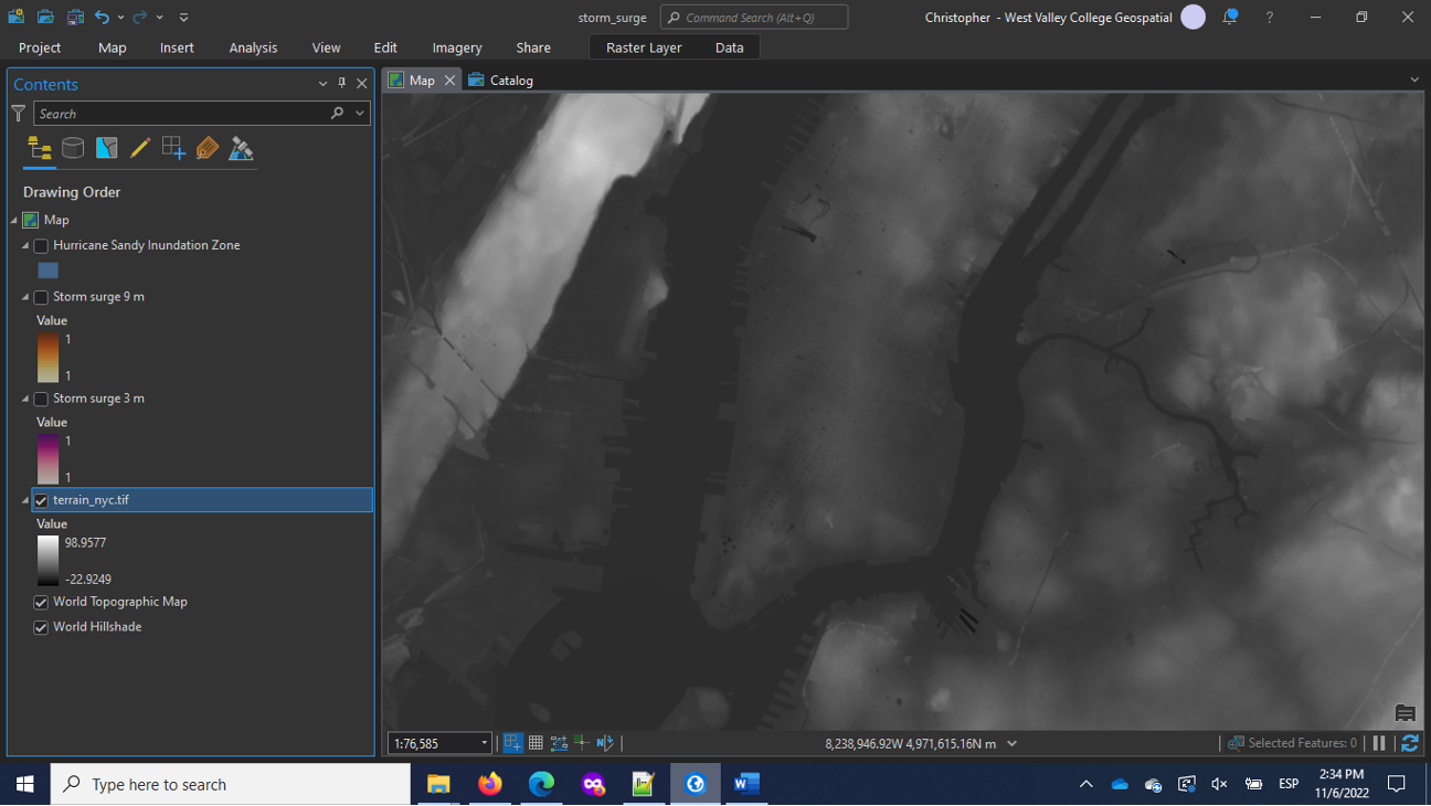
Base Elevation Map
The base elevation map was created using the global Terrain raster from ArcGIS Living Atlas, clipped to the extent of New York City. Each pixel represents elevation in meters, allowing users to identify low-lying areas that are most susceptible to flooding. This foundational map provides the geographic context needed to simulate potential storm surges and serves as the starting point for subsequent flood modeling.
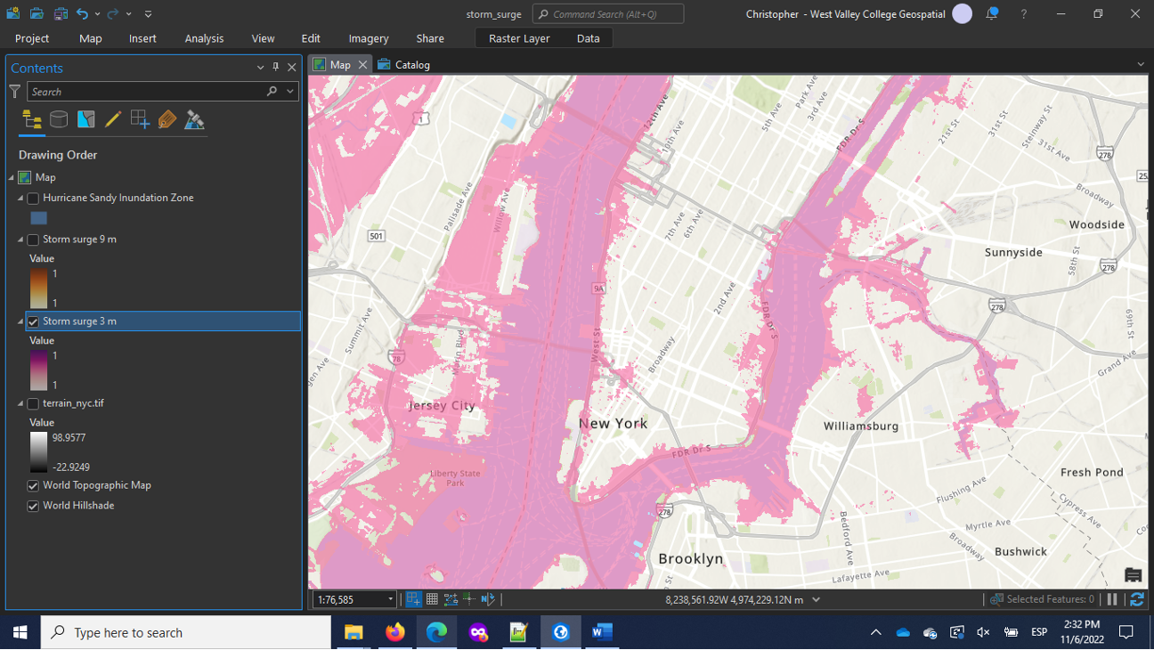
3-Meter Storm Surge Map
The 3-meter storm surge map models a moderate hurricane scenario by highlighting all areas of New York City at or below three meters in elevation. These flooded areas are symbolized in light pink and overlaid with transparency on the basemap, making it easy to see how a surge of this size would affect coastal neighborhoods. This map provides an important perspective on the scale of risk from a surge similar to that of recent hurricanes.
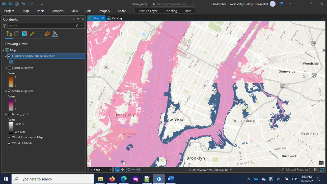
Hurricane Sandy Inundation Map (2012)
The Hurricane Sandy inundation map is based on real flood data collected from the 2012 storm and made available through the New York City Open Data portal. It shows the extent of actual inundation during Sandy, offering a direct comparison to the modeled 3-meter surge scenario. While the two maps align closely, the Sandy layer illustrates that the surge in some areas exceeded three meters, validating the model while also emphasizing the variability of real storm impacts.
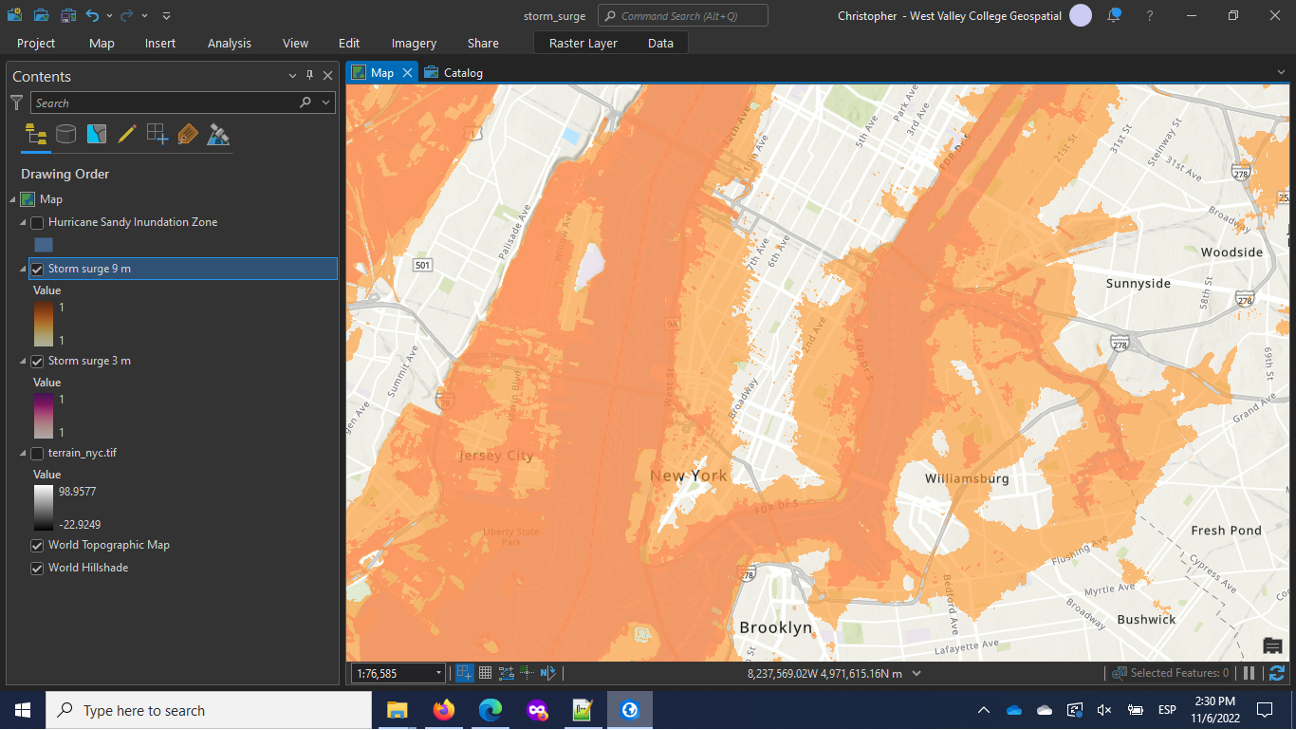
9-Meter Storm Surge Map
The 9-meter storm surge map simulates an extreme event similar to the 1893 hurricane that struck New York with a 30-foot surge. This scenario floods all areas below nine meters in elevation, represented in orange, and reveals the catastrophic scale of inundation that could occur under severe conditions. When compared to the 3-meter surge, it underscores how much additional land and infrastructure would be threatened by a truly historic hurricane.
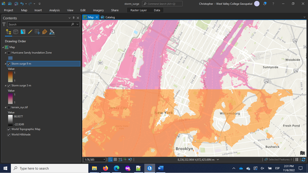
Overlay of 3-meter and 9-meter Storm Surge Maps
The overlay of the 3-meter and 9-meter storm surge maps creates a powerful visual comparison of moderate versus extreme hurricane impacts on New York City. Using the swipe tool, the 3-meter surge layer (shown in pink) can be directly compared against the 9-meter surge layer (shown in orange). Sliding between the two reveals how much additional land becomes inundated as water levels rise from a moderate surge to a catastrophic one. While the 3-meter surge highlights vulnerable coastal neighborhoods and low-lying areas along the shoreline, the 9-meter surge extends deep inland, flooding large portions of the city that would otherwise seem secure. This side-by-side exploration emphasizes the exponential increase in risk associated with higher surge events and allows users to grasp the scale of potential devastation under different storm intensities.
Tools Used
| Tool / Function | Purpose |
|---|---|
| ArcGIS Pro | Main GIS platform used for mapping and analysis |
| Catalog Pane | To search and add the Terrain elevation raster from Living Atlas |
| Export Raster | To clip global elevation data to the New York City study area |
| Remap (Raster Function) | To reclassify elevation values and identify areas below surge thresholds |
| Dynamic Range Adjustment (DRA) | To enhance visualization of local elevation differences |
| Symbology (Color & Transparency) | To style surge maps (pink for 3m, orange for 9m) |
| Swipe Tool | To compare modeled surge layers or with Hurricane Sandy inundation data |
| Pop-up Tool | To inspect pixel values (elevation) in the raster |
Data Sources
| Data Source | Description | Provider / Access Point |
|---|---|---|
| Terrain Elevation Data (Terrain raster) | Global elevation imagery used to model flood extents | ArcGIS Living Atlas (Airbus, USGS, NASA, etc.) |
| Hurricane Sandy Inundation Zone (2012) | Actual flood extent from Hurricane Sandy in New York City | NYC Open Data, Department of Small Business Services |
| Basemap (Topographic) | Background geographic context for visualization | ArcGIS Online (Esri) |
Adapted from learn ArcGIS tutorial "Map hurricane storm surges"